Making a Game Tutorial - Part Five
Extra Stuff
In this section we'll be looking at how we can use the techniques we've already covered in the previous sections to make our game look a bit more polished. By adding a few more text meshes and a few simple scripts, it can really transform the look and feel of the game. You can get the completed package here, and includes things like:
A 'Whack-A-Mole' font which is used for all the in-game text.
Gameplay additions: difficulty levels and variable points dependant on speed of moles being whacked.
GUI interface using tk2dUI functionality, including Main Menu, Difficulty Menu, and High Scores table.
Menu and text animations using HOTween library.
Fonts
Although we covered fonts and text in the previous section, we were just using one of the demo fonts that had already been created for the 2DToolkit. However, the font I am using in the game is one that was converted from a .ttf file, so I will now show you how I got from that ttf file to using the font in the game.
There are plenty of resources on the internet where you can find freely available fonts to use, so you can choose one of those or you can just use the one that is in the 'Mole > Fonts' folder i using GlyphDen the Project window. Once you have have got the ttf file, you can then use a font tool to convert the file into a .fnt and .png file that we can use with the 2DToolkit. Here, I am using GlyphDesigner:
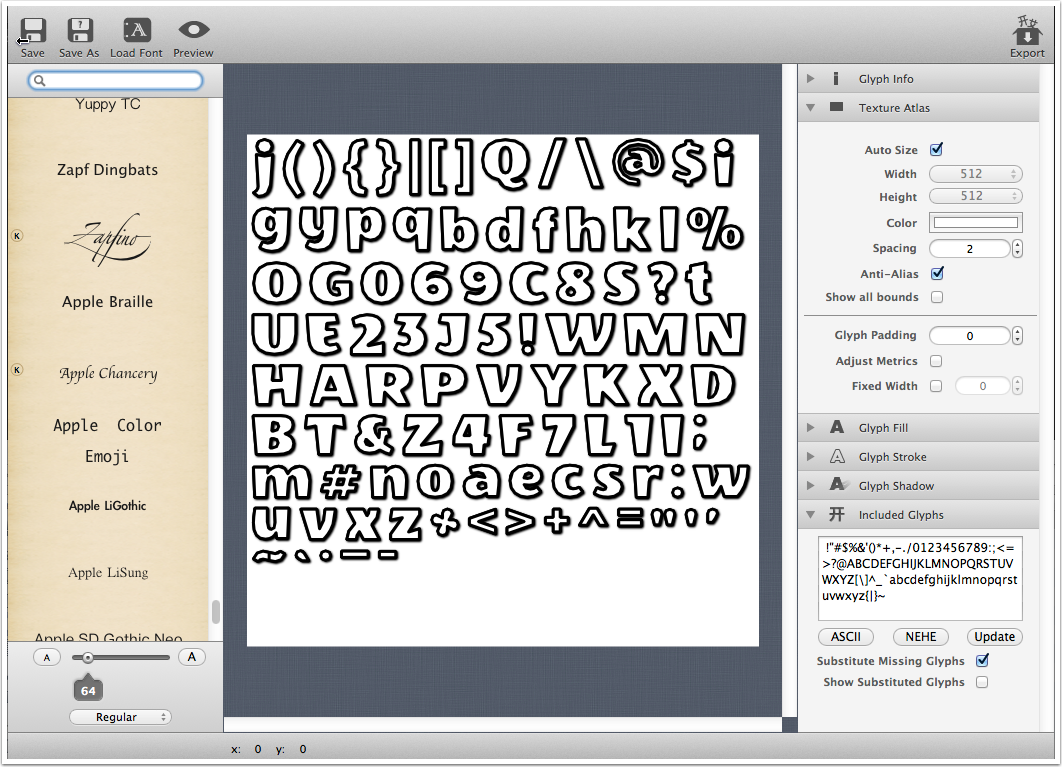
All I had to do was load in the font (ttf) file, then mess around with the various settings - fill, shadow, stroke - until I had something I like. Once that is done, export your newly created font and save it as a .fnt file. You will also need at .png file which GlyphDesigner automatically creates for you.
Note: You can give your font a colour when you're creating it, BUT if you try to change the colour of the font in 2DToolkit, it will be mixed with the colour you have already given the font. So if you will be wanting to change the font colour in 2DToolkit for your games, it is probably best to set the font colour to white which will make it easier for 2DToolkit to change.
Note: You don't have to create a font file that contain all the characters. For example, if you are using one particular font for the score and it is only ever going to be used for that, then you can just choose the letters S C O R E and the digits 0 to 9 to be exported to your font file. This will cut down on the size of your font atlas.
Create a folder in the Project window to keep your fonts in, and copy or move your .fnt and .png font files to there. But before we can use the font in the game we need to create a 2DToolkit font object.
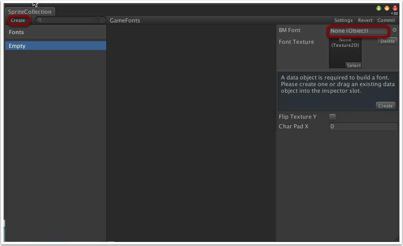
There are two ways to do this: in the Project window, select 'Create > tk2d > Font', buy by doing this you will need a separate font object for every font you wish to use in your game. What I'm going to do instead is select 'Create > tk2d > Sprite Collection'. We can then open the SpriteCollection window by clicking 'Open Editor...' like we did before. Then, in the top left of the SpriteCollection window, select 'Create > Font'. You can then drag the .fnt file from the Project window to the BM Font field, and the toolkit will automatically populate the texture field with the .png file.
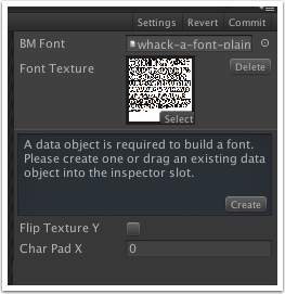
The benefit of creating the font objects this way is that you can have multiple fonts in one texture, but you will still be able to individually identify separate fonts from the drop-down list when you are creating a text mesh.
Effects
If you've played the Whack-A-Mole demo, you may have noticed little effects on the 'Missed' text when a mole escaptes un-whacked, and the points text when you successfully whack a mole; the text rapidly expands and shrinks which is a bit more interesting than having static size or no points displaying at all. This was achieved quite simply by using two loops: one to increase the scale of the text mesh every frame for a period of time, and another loop that decreases the scale of the text mesh every frame. Examples of the code can be seen in the PointScript.cs and MissedTextScript.cs files.
However, there are other tools available that make it even easier for you to put neat little effects into your game and give it more 'professional game' look; for the movement effects on the menu buttons and on the 'Get Ready' and 'Go' text, I used a free utility called HOTween. You can get more detail of how to use HOTween from the official site, but I'll briefly go over the essentials.
After downloading the HOTween package from the official site, uncompress the file and move the HOTween folder to your Whack-A-Mole project's Assets folder.
For any script (C#) you wish to use HOTween functionality in, add the following line to the top of the script:
using Holoville.HOTween;There are two main functions of HOTween I'm using in my scripts: HOTween.To(...) and HOTween.From(...), although the syntax for both is the same. An example of the 'basic' versions of the functions i'm using in my script are:
HOTween.To(gameObject.transform, swipeTime, "localPosition", toPosition);
HOTween.From(gameObject.transform, swipeTime, "localPosition", fromPosition);
Where:
gameObject.transform is the object that contains the properties we are manipulating.
swipeTime is the amount of time in seconds that the 'tween' is going to take.
localPosition is the property of the transform game object that i'm manipulating (for example, you could instead manipulate the rotation or scale of the gameObject).
toPosition//fromPosition are 'Vector3' of where the gameObject is goinng to be moved to or from.
The HOTween.To function will move the gameObject from its current position/size/rotation/etc to the one specified in the function call. Similarly, the HOTween.From fuction will move the gameObject from the current position/size/rotation/etc specified in the function call to its current settings.
However, I tend to use a slightly more complex version of the functions in my script which allows us to do a bit more with our 'tween' e.g.
HOTween.To(gameObject.transform, swipeTime, new TweenParms().Prop("localPosition", new Vector3(defaultPosition.x, -650.0f, defaultPosition.z)).Ease(EaseType.EaseInOutBack).OnComplete(StartGame));
Where the localPosition and To/From position are now part of a parameters list object. This form of the function also allows us add an EaseType to the animation e.g. to make the object come smoothly to a stop, and a callback function so that when the 'tween' completes a function will be called.
Buttons, Menus, and other UI
Although we have managed to make a functional game with the tools we have covered so far, to make it look even better we can use the 2D Toolkit's UI functionality to give a professional looking interface to our game.
Main Menu
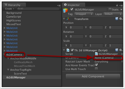
The first step in creating the UI system is to create a UI manager. In the Hierarchy window select 'Create > tk2d > UI Manager', which will add a 2D Toolkit UI Manager to the scene. The script is already attached to the object and we can leave the default settings, the only thing we need to do is associate it with our camera. Select tk2dUIManager in the Hierarchy window then click and drag the tk2dCamera object to the UI Camera field in the Inspector window for the UI Manager.
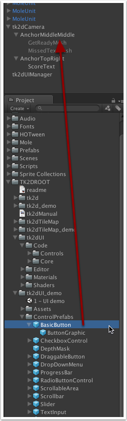
We can now start adding our buttons... In the Project window navigate to 'TK2DROOT > tk2dUI_demo > ControlPrefabs' and select and drag 'BasicButton' from the list of prefabs into the Hierarchy window. I have dragged mine to under the camera's center-center anchor so I can place the button relative to there.
This button we've dragged across is going to be our 'Start Game' button. In the Project window, select the BasicButton you have just dragged across and give it a name (ButtonStartGame) and change the Transform Position Y value so it is near the top of the screen (or you can drag the button itself in the scene window).
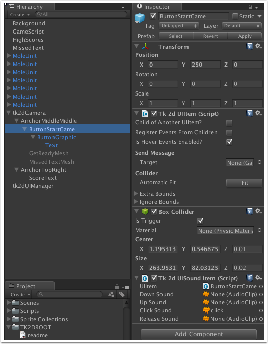
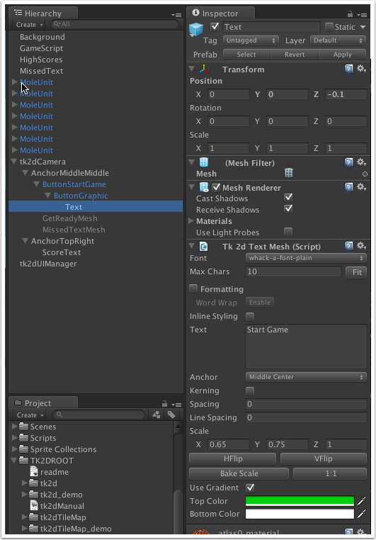
We now need to set-up our button background. Select 'ButtonGraphic' which is a child object of the button you dragged before. In the 'Tk 2d Sliced Sprite' component in the Inspector window, the Collection value should already be set to UIDemoSpriteCollection, but if it isn't then set it to that. Then in the Sprite field, select InputItemBackground. If you're using the tk2d camera then you probably won't be seeing anything because the button is far too small for the camera settings we're using. So in the Scale box and the Dimensions box, change the X and Y values so you get a reasonably sized button. An X value of 420 and Y value of 320 in the Scale box and an X value of 300 and a Y value of 100 in the Dimensions box was suitable for the settings I've been using so far. You can also change the colour of the background by clicking in the 'Color' box and choosing a color.
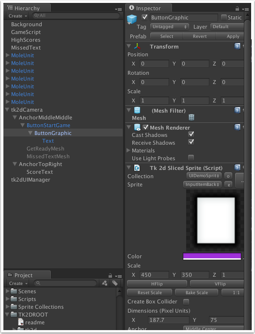
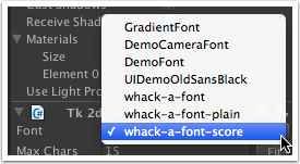
To add text to the button, in the Hierarchy window select Text which is a child of ButtonGraphic. In the Inspector window there is a Tk 2d Text Mesh component which we have seen before. Select a font from the drop-down list (I am using the whack-a-mole game font) and in the 'Text' area, type in 'Start Game'. If the text is too large or too small for your buttons then change the Scale X and Y values so the text is in proportion. Set the color for the text too.
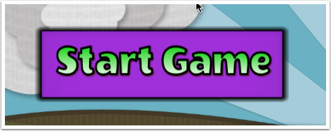
Finally, in Hierarchy click back on the BasicButton, and in 'Tk 2d UIItem' click on the Fit button under Collider. This will make the collider the same size as the button, so clicking anywhere on the button will register it as being 'pressed'. Your final button should end up looking something like this:
If you run the game, and click on the button it should make a noise and 'press', although it won't actually do anything yet as we haven't told it what to do.
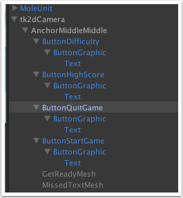
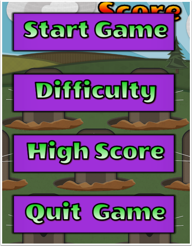
Now that we have one button set up, we can easily copy this to make new buttons for our menu. Right-click on the button in the Hierarchy window, select copy, then paste it 3 times - one button will be the 'Difficulty' menu button, another the 'High Score' menu button and the last will be the 'Quit Game' button. Change the name for each of the new buttons so you can tell them apart from each other, and change the text of them so they no longer say 'Start Game'. Then drag each button to be a child of the anchor we are using and for each button change the Y position value so they are separate from each other; I gave the Difficulty button a Y position value of 100, the High Score button -50 and the Quit Game button -200, but use whatever values that look okay on your game.
We have our menu buttons now, but they don't do anyhing - there is nothing 'behind the scenes' to tell them what to do! In the hierarchy window, select the anchor you're using for the menue buttons, then select 'Create > tk2d > Empty GameObject'. Name this object MainMenuController, and drag our previously created buttons so they're children of this object.
In the Project window, create a new C# script called 'MainMenu.cs' and copy this code into there: MainMenu and either drag the script on to the MainMenuController object in the Hierarchy window, or select 'Add Component > Scripts > MainMenu' in the Inspector window for the MainMenuController. The MainMenu script contains code that we can use to tell each button what to do when it is clicked. The script makes use of the HOTween library to add animation to the menu buttons. If you don't wish to use the HOTween functionality, feel free to write your own code to animate the buttons, or just simply deactivate the menu game object so the buttons disappear.
In the Hierarchy window, select the 'Start Game' button you created before. In the Tk 2d UIItem component in the Inspector window there will be a 'Send Message > Target' option. Drag the MainMenuController object into the Target box, and this section will be expanded allowing you to select which functions to select for different actions on the button. Click on the 'On Click' drop-down box and select 'StartClicked' - now when the button is clicked, it will call this function from the MainMenu script. This function will 'swipe' away the menu, deactivate it, then call the StartGame function in the Main Game script to start a game.
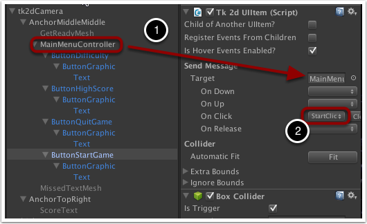
Repeat step 10 for the three other buttons that were created - there should be a corresponding function for each one: DifficultyClicked, HighScoreClicked, and QuitClicked, to be selected from the drop-down box. Note that this functions contain references to other scripts and functions that we haven't created yet, so the High Score button and the Difficulty button won't do anything yet.
Toggle/Radio Buttons - Difficulty Menu
In the previous section we looked at a simple menu structure made with basic buttons. Now we will look at how we can make use of the 2D Toolkit's toggle and radio button functionality.
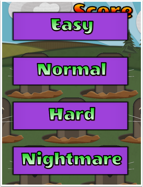
The Difficulty menu will allow us to select which difficulty we want to play the game at - we could just use simple buttons, and when the button was pressed send this information to the main game script and adjust the difficulty accordingly. But it might not be obvious to the player which difficulty mode was selected, but using toggle buttons will make it a lot clearer.
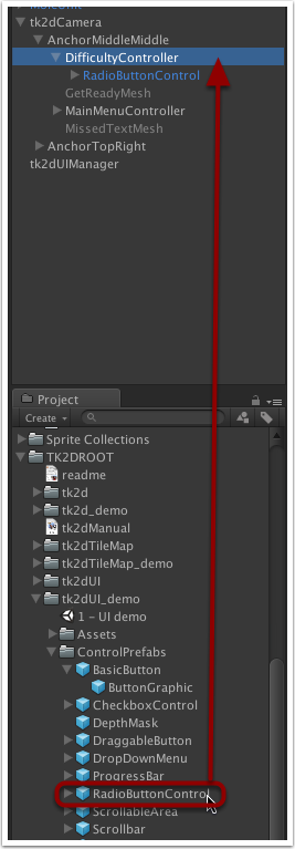
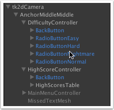
The idea behind radio buttons is that only one can be selected at any one time, and the idea behind a toggle button is that it can be either toggled on or off. Using both bits of functionality we will be able to show which button is currently selected and to automatically de-select any other buttons that were previously selected. To accomplish this, start off by creating an empty game object in the Hierarchy window under the camera and/or anchor you wish to use and name it DifficultyController.
In the Inspector window, click on 'Add Component > 2D Toolkit > UI > tk2dUIToggleButtonGroup'. This component contains the logic that switches between buttons.
In the Project window, navigate to 'TK2DROOT > tk2dUI_demo > ControlPrefabs' and then select and drag the RadioButtonControl prefab to the Difficulty Controller you created in step one. With this radio button control you will be able to specify what the button will look like when it is 'On' and 'Off'.
Name the Radio Button Control something like 'RadioButtonEasy', this is going to be our Easy difficulty button. The object has a 'Description' child object - we don't need this so delete it. You will get a message about losing connection to the prefab, but just click 'Continue'.
The child of the RadioButtonControl object is defaultly called 'RadioBtn'. This is kind of the equivalent of a normal 'basic button' that we used for our Main Menu. We don't need to do anything with this component yet, nor the Graphics compoment the next child down, so keep navigating until you get to the BackgroundOut, BackgroundOver and Check items. These are defaultly set to look like a traditional radio button set-up but I'm going to change the look and feel but keep the same functionality...
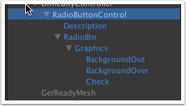
Delete the Check component because we don't need it, then select BackgroundOut - this is the equivalent of the 'ButtonGraphic' object of the basic button. Rename it to 'EasyOut' as this is going to be the 'un-selected' Easy button graphic.
To keep the look and feel of this button the same as our main menu buttons, in the Inspector window remove the Tk 2d Sprite component (Right click on 'Tk 2d Sprite' then select 'Remove Component'), then select 'Add Component > 2D Toolkit > Sprite > tk2dSlicedSprite'. Then in the Collection drop-down box select UIDemoSpriteCollection and then InputItemBackground in the Sprite drop-down box. Then set the Scale X and Y values, and the Dimensions X and Y values to be the same as what you used on your Main Menu buttons (420, 320, 300, 100), then change the Anchor to Middle Center. Change the color also to match your original buttons: click in the color box then you can use the dropper to get the color you used on the Main Menu buttons.
We have got our button and our sprite, but it doesn't have any text yet. To do this the easy way, find the tk2d Text Mesh component from one of the main menu buttons, copy it and paste it onto the EasyOut sprite, remembering to set the X and Y positions to zero (remember, the text will be relative to the sprite). Change the text of the Text Mesh to 'Easy' and the color should already be set to the color of the text on the main menu buttons.
Now we'll created an alternative look for this button, the one that will be displayed when the button is selected. Select the 'BackgroundOver' sprite and rename it 'EasyIn'. Then repeat steps 7 and 8 for this button, however, change the color of the background and the text so it is the opposite of what the 'un-selected' button looks like, i.e. the background color of the un-selected button becomes the text color of the selected button, and the text color of the un-selected button becomes the background colour of the selected button. Of course, you don't have to use this color convention, but just change it so that you can tell the two buttons apart. Also remember to set the scale to match the EasyOut button.
Go back to the RadioBtn object and in the Tk 2d UIItem component, click on the 'Fit' button under 'Collider > Automatic Fit' in order to set the size of the collider for the button. Also while we're here, delete the Tk 2d UIUP Down Hover Button component as we aren't concerened with doing anything whilst hovering over the button.
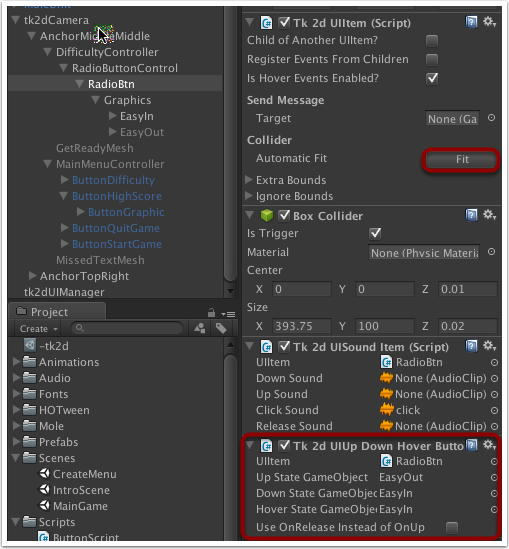
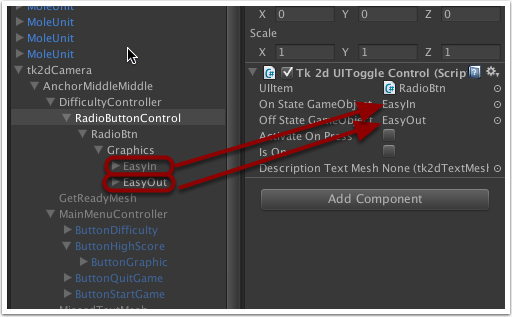
Then go back to RadioButtonControl and drag EasyIn to the 'On State GameObject' and EasyOut to 'Off State GameObject' and un-check the Is On button as we wan't the default state to be off.
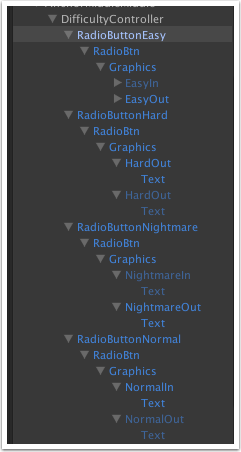
Okay, that's one button done and we need to create buttons for the rest of the diffculties we want. You can either repeat steps 3 to 11 for the rest or just copy and paste the 'Easy' radio button you just created for the rest, or even make the 'Easy' button a prefab which will also let you duplicate it. I am going the prefab route; remember to customize each button with the correct text (Easy, Normal, Hard, Nightmare) and adjust the transform position's Y value so they are spread out. Also, for the RadioButtonNormal you can check the 'Is On' check-box as this will be our default difficulty value. When you have done all that you should end up with something like this:
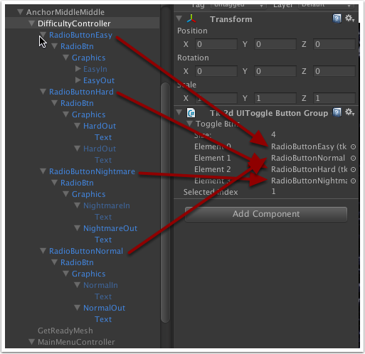
Finally, go back to our DifficultyController that we created in step 1 and set the 'Size' value to 4 (for the 4 buttons) and set the 'Selected Index' value to 1 (as the Normal is going to be our starting default difficulty and 1 will be the index of this button - remember, indices start at zero!). Drag RadioButtonEasy from the Hierarchy window to 'Element 0' in the Tk 2d UIToggle Button Group component, RadioButtonNormal to 'Element 1', RadioButtonHard to 'Element 2' and RadioButtonNightmare to 'Element 3'. This controller will ensure that only one of the buttons in the group will be selected at any one time. If you run the game and click on the buttons you can see this happening (You can temporarily deactivate other menus/buttons/etc in order to see the difficulty menu buttons).
To get which button has been selected, the Tk 2d UIToggle Button Group 'SelectedIndex' property that can be queried to see which button is currently selected. This can then be passed to the game code which sets the difficulty.
High Score Table using Tk 2d UIScrollable Area
Another useful component of the toolkit UI system is the scrollable area. In this section we will look at how we can use this to make a High Score table for our game.
In the Hierarchy window, under your camera and/or an anchor, create an empty GameObject in the Hierarchy window and call it HighScoreController.
Drag the ScrollableArea prefab from 'Project window > TK2DROOT > tk2dUI_demo > ControlPrefabs' to the HighScoreController gameObject. Select the 'ScrollableArea' which you have just dragged and call it 'HighScoresTable'.
Expand the HighScoresTable game object and select 'Background'. You can select your own background for the high-score table, but I'm just going to use the default 'InputItemBackground' in the UIDemoSprite collection. Pick a color for it (I'm using the same background color as I did for the buttons) and change the X and Y scales of it so its a decent size. Also, change the anchor to 'Upper Left' if it isn't already; this will probably have the scrollable area off the bottom of the game space, but that's okay because we'll change it in a bit.
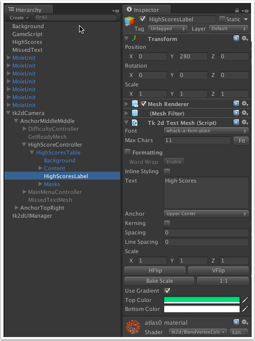
In the Hierarchy window, find the 'Content' object and expand it. There should be a 'TestText' Text Mesh object which will hold our high scores. Again, change the name (to 'HighScores'), select the font, change the color, and in the 'Text' field and the numbers 1 to 10 with a newline between each one. Also disable word wrap and change the Transform X Position so the text leaves a margin to the left. Don't change the Y value - we need the text at the top for now. Your table looks something like this:
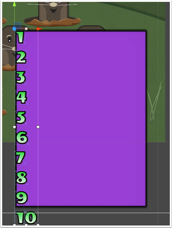
In the Hierarchy window, select the HighScoresTable object again and move the table so that it is roughly in the middle of the screen, then select the Background object and change the Y position value so that there is a bit of space above the first high-score item - we need some space to put our header there.
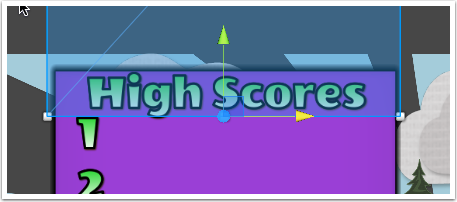
Select HighScoresTable in the Hierarchy window and select 'Create > tk2d > Text Mesh' (You will find this under the 2D Object submenu in Unity 4.6 and higher) as this is going to be the title for the high score table. Change the name of it to 'HighScoresLabel' and select a font (the whack-a-mole font if you're using it), change the text for it to 'High Scores', set the color and adjust the position so it is at top of the scrollable area and acts as a header to the high score table.
Select the HighScoresTable object again in the Hierarchy window and then click on 'Calculate content length' in the Inspector window - this is why we use the 'upper left' anchor for the background sprite; to ensure that the content length is calculated properly. This will set the 'Content Length' value to be big enough to hold your 10 high scores. In Scene view, there should be a red arrow pointing down near the top corner of the high score table - this will allow you to adjust the 'Visible Area Length' value (a red horizonatal line slightly above the arrow defines where the end of the visible area). This means when you scroll, the bottom item in your scrollable list will scroll to the end of the visible area you have defined. You can either adjust this value in the Scene view by grabbing and moving the red arrow, or just change the value in the Inspector window. Also, remember to click on the 'Fit' button under 'Collider > Automatic Fit'. If you now run the game to test the scrollable area, the test text you entered should move up and down when you scroll the mouse wheel over the area.
Note: In reality, if you were just going to display the top 10 high scores, you would alter the size of the font or the table area to ensure all of the high scores were on the screen at the same time - the purpose of this is part of the tutorial is to show how the scrollable area works.
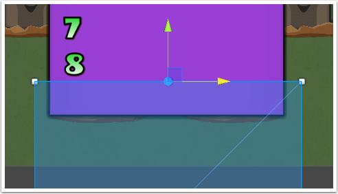
If you ran the game and tried to scroll the text you will have noticed that the text in the scrollable area was still visible outside of the scrollable area and also covered the High Scores title. We aren't quite done yet! We can use the masks of the the scrollable object to block out the content text when we don't want it to be seen. In the Hierarchy window, navigate to Masks in the HighScores Table and there should be a TopMask and a Bottom Mask object. Select one of these and look at the inspector window: there will be a component 'Tk 2d UIMask' and it has a field called 'Depth', and as usual it has a Transform component. IMPORTANT! In order for the masks to work properly, the Z value of the mask plus its depth must cover the content text you want to cover. Therefore you want the content to have a different Z value to the rest of the scrollable area components so that you can set your masks to cover the content withough covering anything else in the scrollable area. Change the X, Y and Z positions for each mask and also scale it enough so they will cover the top and bottom of the scrollable area, something like this:
Now when you run the game and scroll, the numbers in the scrollable area should be covered when they are 'in' the masks!We need a way of storing the high scores, and Unity provides a pretty easy way of doing this... PlayerPrefs. PlayerPrefs was designed to store player preferences between game sessions, but there's no reason why we can't use this functionality to store high scores. All we need is a key to store the value against and we can retrieve it when we need to, e.g.
  PlayerPrefs.SetInt("HighScore1", value_1);
  PlayerPrefs.SetInt("HighScore2", value_2);
  int hs1 = PlayerPrefs.GetInt("HighScore1");
  int hs2 = PlayerPrefs.GetInt("HighScore2");
So when there is a 'Game Over', check to see if the score is higher than any of the current high scores and store it. Then when you display the high score table, just retrieve the high scores from PlayerPrefs. The Text field of the Content Tk 2d Text Mesh can be overwritten with the high scores so the list can be populated.
Back Button
On both the High Scores screen and the Difficulty screen, we need a way of getting back to the main menu after a difficulty has been selected or the high scores table viewed.
From the Project window, 'TK2DROOT > tk2dUI_demo > ControlPrefabs' drag a BasicButton prefab to your camera (or camera anchor) in the Hierarchy window.
Select the button in the Hierarchy window and change the name to 'BackButton'. Change the button graphic and color to match the existing buttons you've created, position it on the screen so it is center-bottom, change the cale of the background so you can see the button and change the text of it so it says 'Back'. And finally, remember to click on the 'Fit' button to set the size of the collider.
Drag your back button to the Project window to make it a prefab - as we will be using the button twice, on the High Scores screen and the Difficulty screen, we will use two instances of the button. You can delete the original back button from the Hierarchy window if you like.
Drag your back button prefab from the Project window onto your Hierarchy DifficultyController, and again from the Project window onto HighScoreController. You now have a back button on each of them...
The functionality of the back button will be to get rid of the current screen (either the Difficulty screen or the High Score screen) and return back to the main menu. To make this easy, we're going to use a callback function which will be passed to the High Score controller and the Difficulty controller when either of those are activated. Then when the back button is clicked, the callback function will be called which will bring the main menu back. The basic method behind this is...
- The script for the main menu will contain variables for a DifficultyController script and a HighScoreController script.
- The main menu script will have functions defined with what to do when the back button is clicked on the HighScore screen and the back button is clicked on the Difficulty screen (e.g. the function for the Difficulty back button might pass back the index of which difficulty button is selected). These will be our callback functions. E.g.
private void OnDifficultyEnd(int diff)
        {
            gameObject.SetActive(true);       // When the back button is pressed and the difficulty screen ended, activate current object (Main Menu)
            MainGameScript.Instance.Difficulty = diff;      // Send the chosen difficulty level to the main game script
}- These callback functions will typically activate the main menu, but you can put in as much functionality as you like, or may animate the main menu coming back in.
- When the 'Difficulty' button is pressed in the main menu, the Main Menu script will call the function from the DifficultyController script to activate and show the difficulty menu, and also pass the Difficulty back-button callback function which is then stored to be used later. The same thing will happen for the High Score table when the High Score button is pressed. E.g.
public void DifficultyClicked()
        {
            difficulty.Show(OnDifficultyEnd);     // Show the difficulty menu and pass in the callback function
        }
In the DifficultyController Script:
private System.Action<int> callback;

        public void Show(System.Action<int> callback)
        {
            gameObject.SetActive(true);
            this.callback = callback;
}- When a back button is pressed, it will deactivate the current screen (difficulty or high scores) and then call the callback function.
void BackButtonClicked()
        {
            int difficulty = toggleGroup.SelectedIndex;
            callback(difficulty);
        }
And that's pretty much it for the user interface for the game. I have skimmed over some stuff here in order to keep it concise, but you can download our package at the top of this page where you can go through the scripts and how they interact with the game objects. And feel free to change the scripts or to create your own to change how the game works - our game was kept relatively simple since it was a tutorial, but there is nothing stopping you from making it a lot more complex. Have fun!